What is a PivotTable, a PivotChart and a Slicer in Excel? These are features that work very well together to create an interactive separate report. Take raw data and build that report and change the way it looks and analyzes your data. A PivotChart is an interactive chart where you can change the view, suppress things and instantly see your changes. A Slicer is push button interface that allows people to drill down and see specific results from your report. So, how can you create a report with a PivotTable, a PivotChart and a Slicer on one sheet? Check it out!
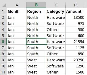
1. Create your PivotTable from your raw data by clicking anywhere in the series.
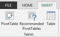
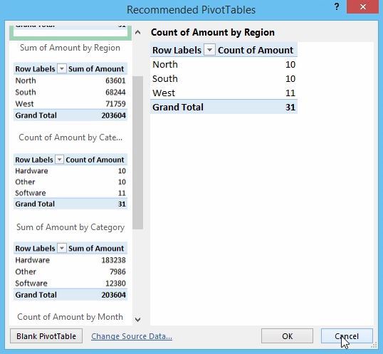
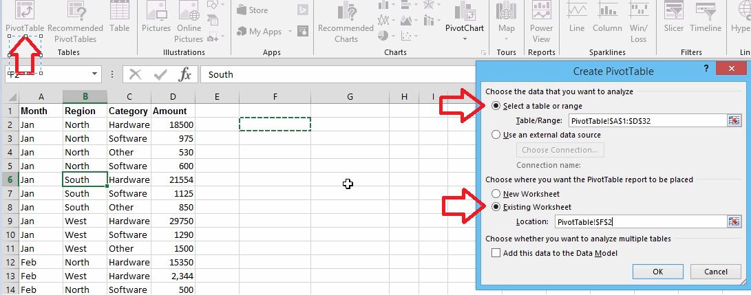
2. Click on the Insert tab and check out a new feature that is only offered in Excel 2013 called Recommended PivotTables.
3. Excel 2013 attempts to find options that may work well for you without having to do any work at all. They are suggestions, however in earlier versions you’ll need to click the PivotTable button and make your choices manually on your own from 2007 on.
4. To create a PivotTable yourself, click on the PivotTable button and notice the Create PivotTable dialog box that appears. In this screenshot, you can see that our table or range is automatically entered because we clicked anywhere in our raw data. Typically, you would choose to place your PivotTable in a new worksheet. Since we want these features on one screen, we’ll click on the cell F2 and select Existing Worksheet. Click OK.
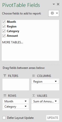
5. Drag and drop to choose fields to add to your report into the areas below and create a PivotTable that works best for you.
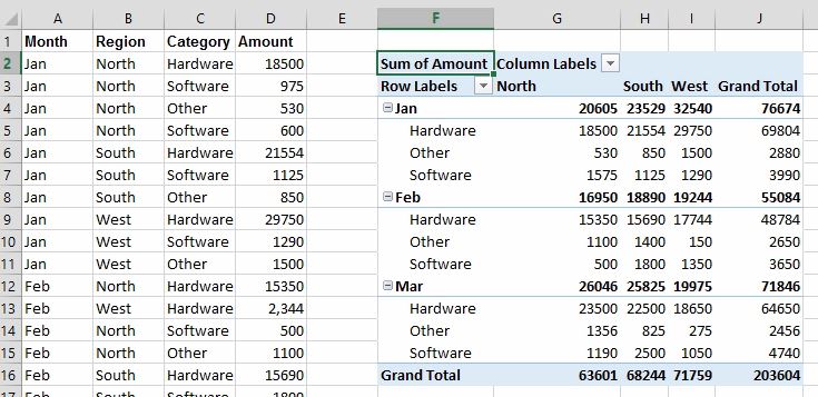
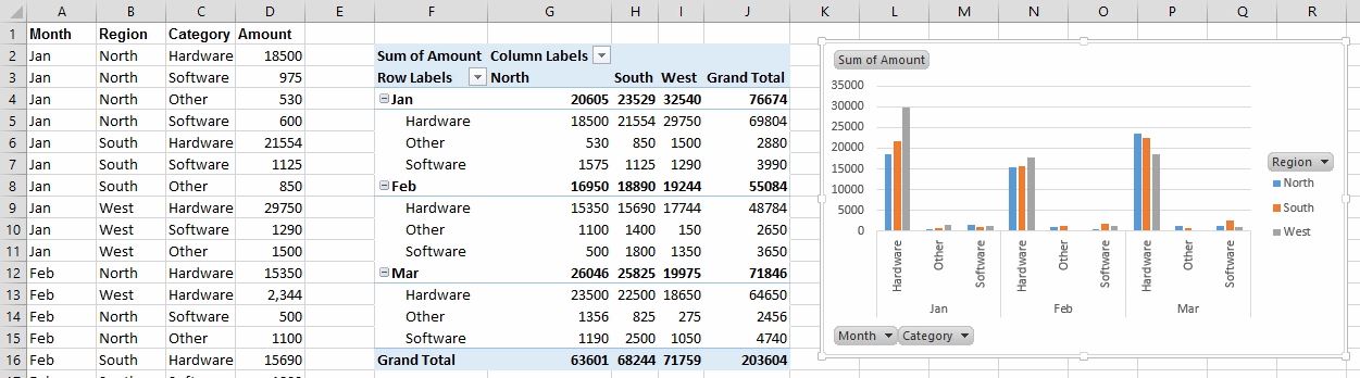
6. Below is a screenshot of what the PivotTable will look like with the choice made in the fields. Also, notice that it is on the same sheet as the raw data.
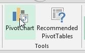
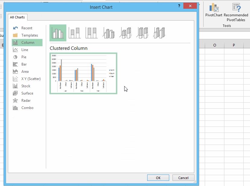
7. To insert a PivotChart, click on the PivotChart button in the Tools group of the Analyze tab.
8. Make a chart selection and even see a live preview of what the finished chart will look like and click OK.
9. Reposition the PivotChart to create the view that works best for you.
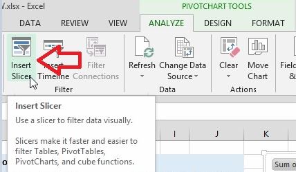
10. To insert a Slicer, click on the Insert Slicer button in the Filter group on the Analyze tab.
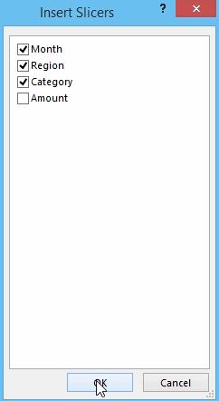
11. Next, decide which push button Slicers that you would like to display. Here, we’ll choose Month, Region and Category. Click OK.
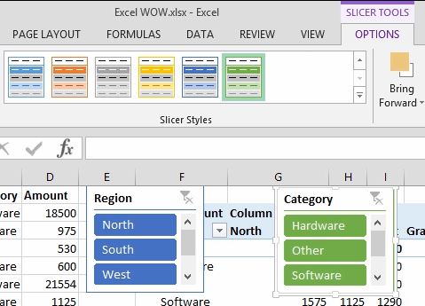
12. Drag the Slicers and position them wherever you would like. To resize your slicers, click on one and then hold down the Shift key. Select the others and resize all at the same time. You’ll see a Slicer Styles gallery on the Options tab on the Slicer Tools contextual tab where you can customize the colors of your Slicers.
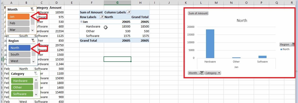
13. Organize your Slicers and click on any button that you would like to display ONLY that data. You can select only January and only North, for example. The PivotTable and PivotChart are instantly updated to reflect the choices. To show more than one choice, hold down the Ctrl key down and make your selections.
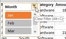
14. To clear the filters, click on the filter button on the top right of the Slicer.
Displaying these features all on one sheet is an awesome way to create interactivity within Excel to quickly and easily analyze and display your data!
Would you like to learn more about Excel tools? Watch the video that has over a million views:10 Microsoft AHA moments in Microsoft Excel!